WALLET CAMPAIGNS
The CEO of Wallet Campaigns approached me in the early stages of his business concept. He explained in detail how his company would bridge the gap between credit card companies and banks, offering a new payment method that includes national and international money transfers and multi-currency accounts.
The service would allow users to send money abroad, receive payments, and manage their finances with a variety of tools, including budgeting features, real-time spending notifications, and in-app insights into their spending habits, all designed to help users stay on top of their finances and make informed decisions.
BUSINESS TYPE
DIGITAL WALLET
YEAR
2022
DETAILS
BUSINESS TYPE: DIGITAL WALLET
YEAR: 2022


THE CHALLENGE
The information package I received outlined the need for a minimalistic and friendly logo, with a striking icon that would capture the overall brand’s look and feel. The colour palette was also expected to reflect this approachable tone. It was important that the logo emphasized the concept of a "wallet" rather than focusing on the card or digital service aspect.
The final design needed to ensure the brand maintained a strong presence in both print and digital formats, appealing to a broad demographic, with a focus on university students and young adults.
CATEGORY
LOGO AND IDENTITY DESIGN
CREDITS
N/A
OVERVIEW
CATEGORY: LOGO AND IDENTITY DESIGN
CREDITS: N/A


THE OUTCOME
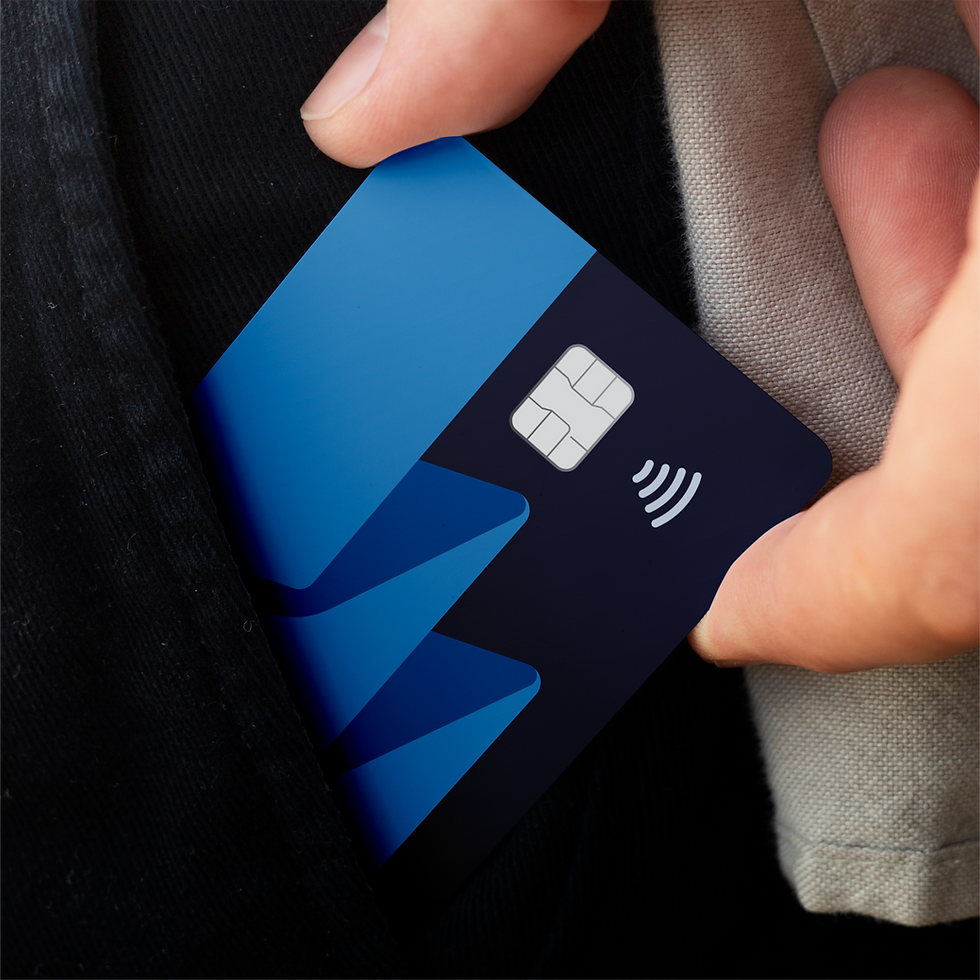
To create a friendly and appealing look for the youthful target demographic, I chose a lowercase approach for the logo and all type deliverables. A rounded style for the logo felt fitting for this friendly aesthetic, which was translated into a stacked card logo icon that symbolized the "W".
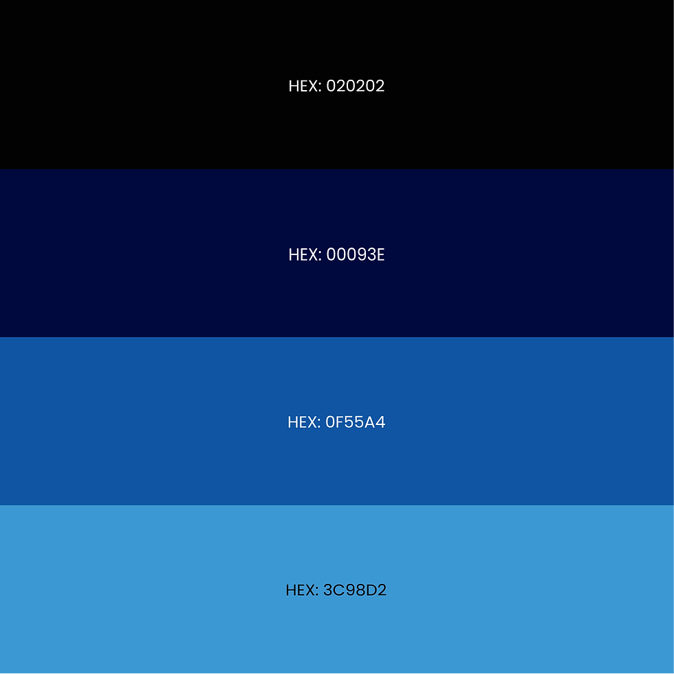
After some experimentation, I selected a three-tone blue colour palette, often associated with calm, trust, and stability. To further emphasize the friendly, youthful aesthetic, I developed a set of illustrations and icons that conveyed the same approachable, rounded tone, showcasing these in both digital and print formats.
SOFTWARE USED