
UW PARTNER
Compared to traditional methods of gaining customers through advertising and campaigns, UW built its growth around a Partner system. This is a network of individuals who promote and refer others to UW’s services in exchange for income and incentives. These Partners help customers switch to UW for energy, broadband, mobile, and insurance using word of mouth.
With this system at the heart of UW’s story, it’s essential to communicate with the Partners through a consistent brand identity. This builds trust, strengthens recognition, and supports a clear and engaging visual journey.
BUSINESS TYPE
MULTISERVICE PROVIDER
YEAR
2023
DETAILS
BUSINESS TYPE: MULTISERVICE PROVIDER
YEAR: 2023
THE FOUNDATION
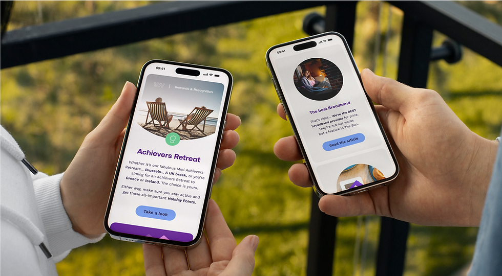
When it came to the Partner Email system, it was made up of three categories: Reward & Recognition, Tips & Tools, and Product & Services. The existing design language for these emails was intentionally created to look noticeably different from one another to help each category stand out. However, this approach introduced inconsistencies with the rest of the brand, making them feel disconnected from the overall identity.
Moving forward, the process involved analysing the current design system, identifying what worked and what didn’t, carry out colour testing for accessibility and create a cohesive visual journey that aligned with the brand.
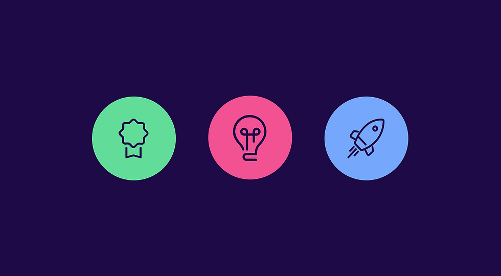
CATEGORY
EMAIL DESIGN
CREDITS
DIGITAL LEAD: MATTHEW NEOPHYTOU
OVERVIEW
CATEGORY: EMAIL DESIGN
CREDITS: DIGITAL LEAD: MATTHEW NEOPHYTOU

THE OUTCOME
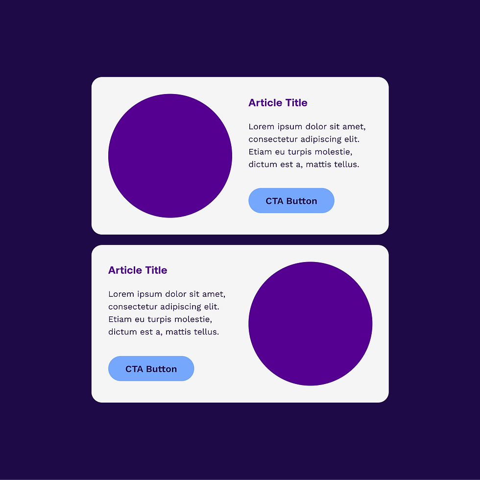
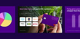
After analysing the emails and collecting data, I worked alongside the Digital Lead to identify key elements of the existing design language that could better align with the brand. We introduced a left-to-right module system, creating a smoother visual journey for the reader. To help differentiate the categories, we developed a colour symbol system, assigning consistent colours to each email and mirroring those in the footers to tie it all together.
The new design system worked as a unified set, rather than a disconnected experience between the three categories. By incorporating lighter colours, we also improved accessibility for a broader range of users.
SOFTWARE USED


OTHER DELIVERABLES
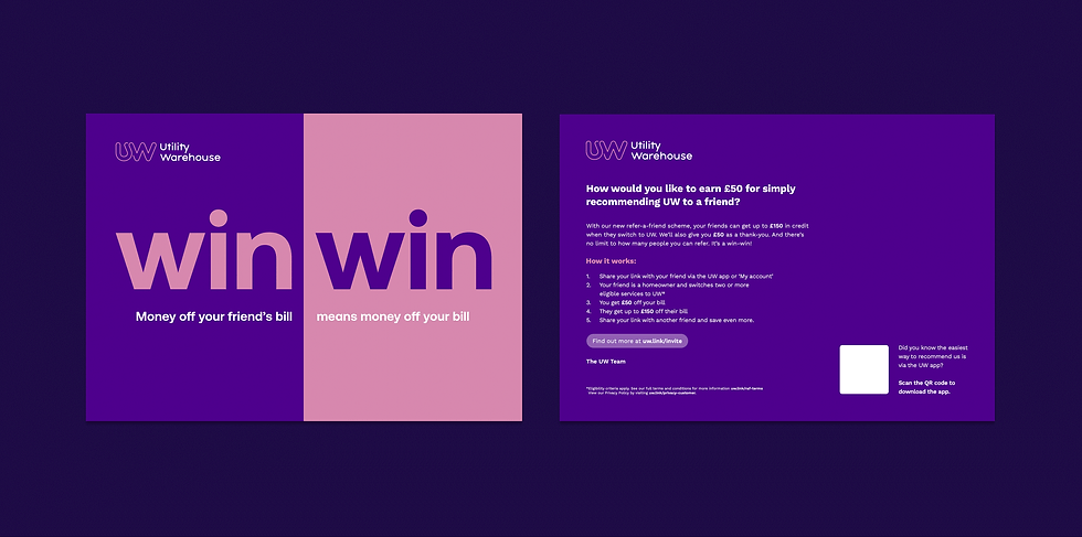
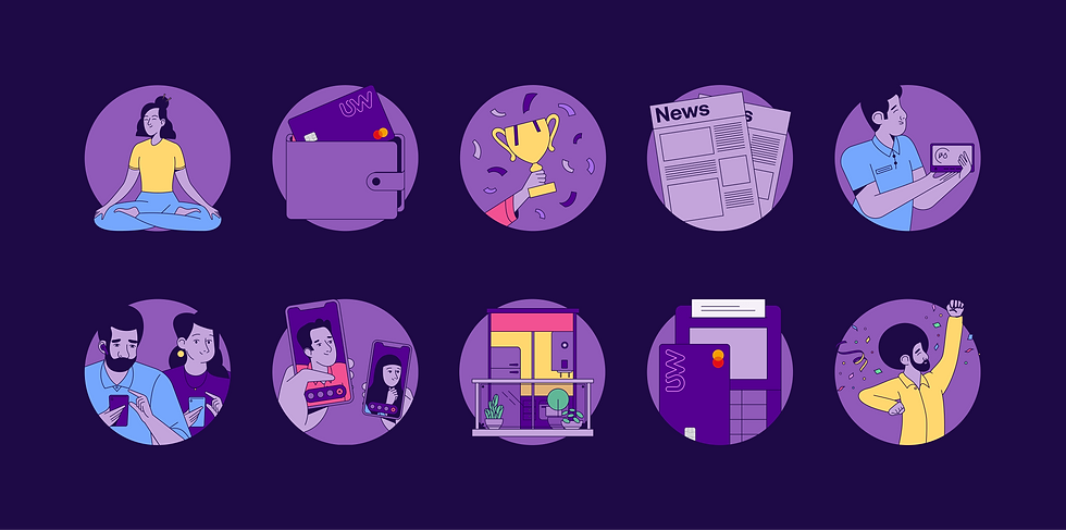
Although I spent much of my time designing, maintaining, and building emails for the UW Partner team, I also created a variety of other deliverables to support their communication with Partners. This included a range of leaflets for Partners to use when going door-to-door, Partner Portal assets to help them stay up to date with company news and announcements, and the monthly Partner Leader call presentations, which featured charts, updates, and network-wide promotions.
All of these deliverables were designed in line with UW’s brand identity to support a consistent visual journey.
CATEGORY
PRINT, PRESENTATION AND DIGITAL DESIGN
CREDITS
N/A
OVERVIEW
CATEGORY: PRINT, PRESENTATION AND DIGITAL DESIGN
CREDITS: N/A


