JAVA HUB
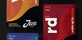
Java Hub was created to bridge the gap between affordable and premium coffee, offering a fresh option for a new wave of coffee lovers. It all began with a bold and colourful product that shaped a vibrant identity, designed to stand out in a crowded market.
From the beginning, Java Hub wasn’t just about appealing to specialty coffee fans. It was about welcoming curious newcomers with great tasting, approachable coffee. “Wake up to coffee” was the idea that started it all. Simple and welcoming, built around making great coffee for everyone to wake up to and enjoy.
BUSINESS TYPE
COFFEE SUPPLIER
YEAR
2021
DETAILS
BUSINESS TYPE: COFFEE SUPPLIER
YEAR: 2021


THE BRIEF
I was tasked with creating packaging that would define Java Hub’s identity and help it stand out in the specialty coffee market. The design needed to be youthful and modern, moving away from the vintage or minimalist styles commonly found in the industry.
The goal was to develop a bold and colourful range of coffee bags for four distinct blends, each with a different strength. The design had to ensure each bag stood out individually while maintaining cohesion across the entire range, appealing to a new generation of coffee drinkers in search of something fresh.
PROJECT CATEGORY
PACKAGING DESIGN
CREDITS
PHOTOGRAPHY: PAUL ASTLEY
OVERVIEW
CATEGORY: PACKAGING DESIGN
CREDITS: PHOTOGRAPHY: PAUL ASTLEY


THE OUTCOME
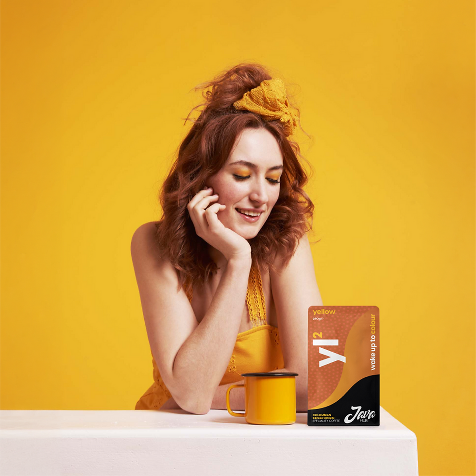
By incorporating the brand’s strapline “Wake up to colour,” the packaging design focused on distinct patterns and vibrant colours, which were also used as acronyms for each blend, making them visually stand out. The number next to each acronym indicated the strength of the coffee, replacing the usual graphic chart method.
The style of the bag echoed the roundness of Java Hub's logo, tying the design together. As a result, the packaging not only stood out on the shelves but also created a strong, memorable connection with Java Hub’s target audience.
SOFTWARE USED